A candlestick chart is simply a chart made up of candlesticks, to describe the movement of price in a particular timeframe. This timeframe can be 1 minute, 5 minutes, 15 minutes, 1 hour or 1 day.
The other types of charts you will see on various financial websites are Mountain Charts, Bar Charts or Line Charts. Many people who use technical analysis use candlestick charts because it is supposed to give you deeper insight into the price action.
Price And Time Charts
How do you represent how price changes over time? With a price time-chart.
There are 3 main price times charts used:
- A candlestick chart
- A bar chart
- A line chart
The only difference between a candlestick chart and a bar chart is the body: the candlestick chart has a body but a bar chart does not.
Candlestick Charts
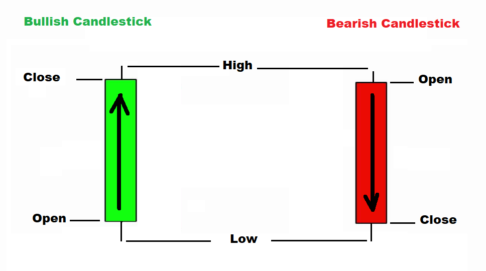
Each candlestick in the chart represents 4 important information about how the price of the asset moved during that specific time period:
- The opening price.
- The closing price
- The high price
- The low price
Bullish Candlestick
If a candlestick opened at one price, and then closed at a higher price at the end of a period or timeframe, that is a bullish candlestick.
You can read more details about bullish candlesticks.
Bearish Candlestick
If a candlestick opened at one price, and then closed at a lower price at the end of the period / timeframe, then that is a bearish candlestick.
You can read more details about bearish candlesticks.
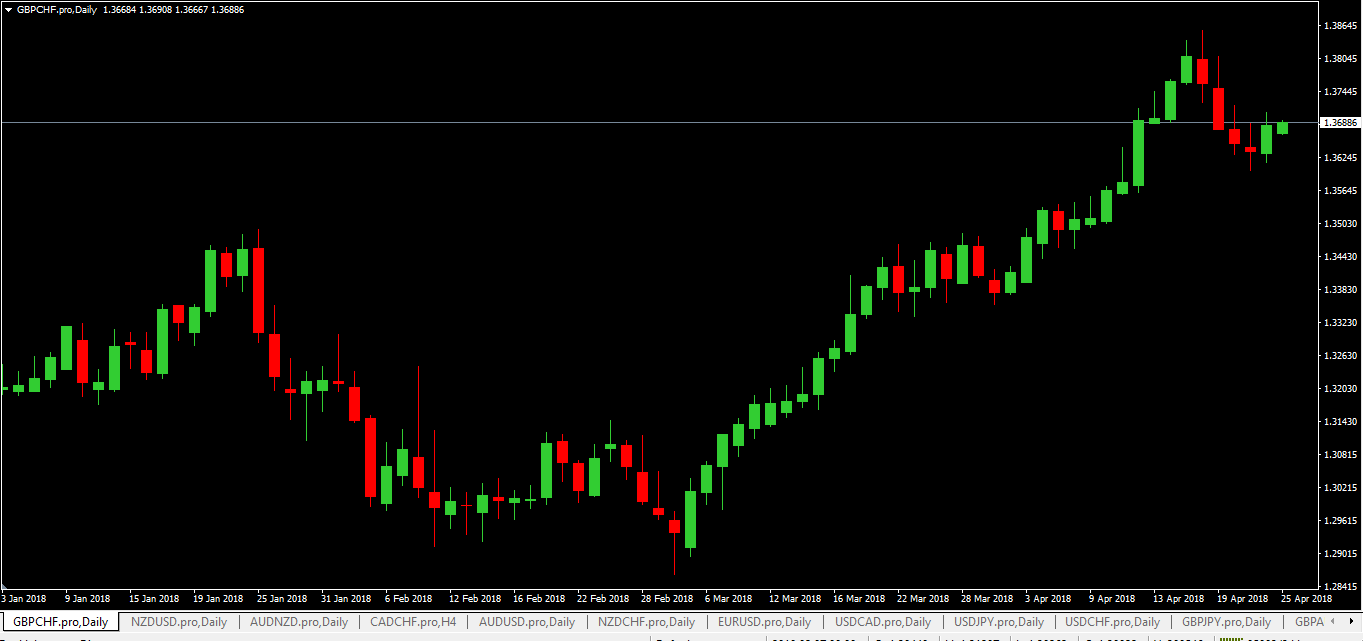
Once you have all these bullish and bearish candlesticks together, one after another in a chart, then you have a candlestick chart.
Below is an example of a GBPCHF daily candlestick chart:
- Each of these candlesticks represents 1 day (24 hours). Once 24 hours is up, the next candlestick forms. This is also referred to as a daily chart.
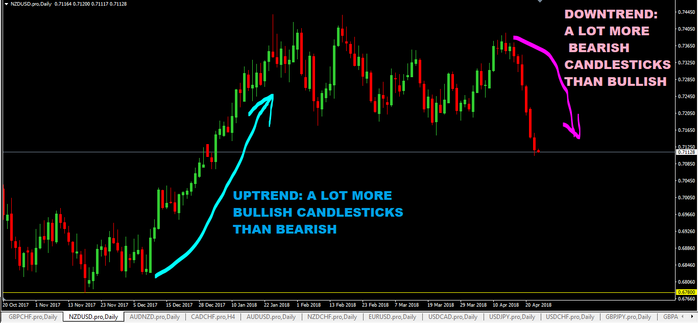
How To Read And Analyze A Candlestick Chart
It’s really simple: if you see a lot more bullish candlesticks form in sequence in a chart, the trend will generally be an uptrend.
The opposite is also true: If you see a lot more bearish candlesticks in a candlestick chart, the trend will most likely be a downtrend.
The NZDUSD daily chart below gives an example of this…
Effectiveness of Candlestick Charts
Expert traders speak about using 3 charts to confirm price action.
What does this mean?
A trader for example sees 3 green bars on their chart, and decides now is the perfect time to enter the trade. Another trader is looking at the same asset, and sees 1 green and 2 red bars, and says it is not a good time to go long.
What is the difference between the 2 traders?
Very simple, one is looking at a chart with 5 minute bars, and the other is looking at a chart with 15 minute bars.
Therefore, it is important to place around with time frames and bar sizes, to confirm your trading decisions.